New Market Trading Co.
2024 — 2025
UX Case Study · DeFi · 2024–2025
Designing a multi-chain DeFi portfolio platform from scratch — across six visual themes, four core flows, and months of weekly iteration with the product lead.
Role: Product Designer · Platform: Web App · Process: Weekly iteration · Scope: End-to-end
01 — Project Overview
One platform for everything a DeFi user actually needs.
NMT (New Market Trading Co.) is a DeFi portfolio management platform built on Safe (formerly Gnosis Safe) infrastructure. Users connect their Safe wallet, see their full portfolio picture, explore liquidity pools and yield protocols, configure positions, and track performance — all without leaving the app.
The product serves two user types: owners (individuals managing their own Safe) and associates (advisors managing positions across multiple client Safes simultaneously). Each user type has a different homepage, different permissions, and a different version of the explore-to-execute flow.
The core flows
Connect wallet → Overview → Explore DeFi → Select a pool → Configure position (Swap, LP, or Zap) → Choose safes → Summary → Execute. Every page in the product sits inside one of these flows.
The Zap model
Instead of requiring users to hold both tokens in a pair, NMT's Zap lets them enter a liquidity position using any single asset they already hold. The platform handles the swap and ratio automatically. This was the hardest flow to design.
The associate model
Associates are advisors who manage DeFi positions across multiple client Safes. They configure one position, then apply it to many Safes at once — each with a different dollar amount and asset. The summary and execute flow had to accommodate this entirely.
My scope
I designed the full product end-to-end across six visual themes: every screen state, every flow, every empty state, every modal. Design was done iteratively — weekly sessions with the product lead (CT), presenting multiple options and refining based on direct feedback.
6Visual themes · 5Core user flows · 26+Screen states · 730+ Wallet providers
02 — Exploration & Discovery
Understanding who uses this and what they're scared of.
The design process started with understanding two users: Jonathan, the Safe owner managing his own portfolio; and the associate — an advisor running positions for multiple clients at once. Both operate in DeFi, which means both carry real financial exposure every time they interact with an interface.
“The clients are 50+ year olds. They might not notice something if it's too subtle. They know how to use a dropdown — they've been using computers. But they'll panic if a transaction goes silent.”
— CT (Product Lead), design session
What the research told us
The key tension wasn't missing features — it was information overload. Early versions of the overview table tried to show everything at once: value, APR, P&L, projected earnings, actual earnings, range status, protocol, chain. It was too much. Users couldn't scan it.
The same problem existed in the other direction: the production version of open positions was hiding critical data behind tooltips and collapsed rows. APR required a hover. Range status wasn't visible at all. Users had no idea how a position was performing without clicking through.
The design challenge was finding the middle — show enough to be useful at a glance, hide enough to stay clean, and make the detail one intentional click away.
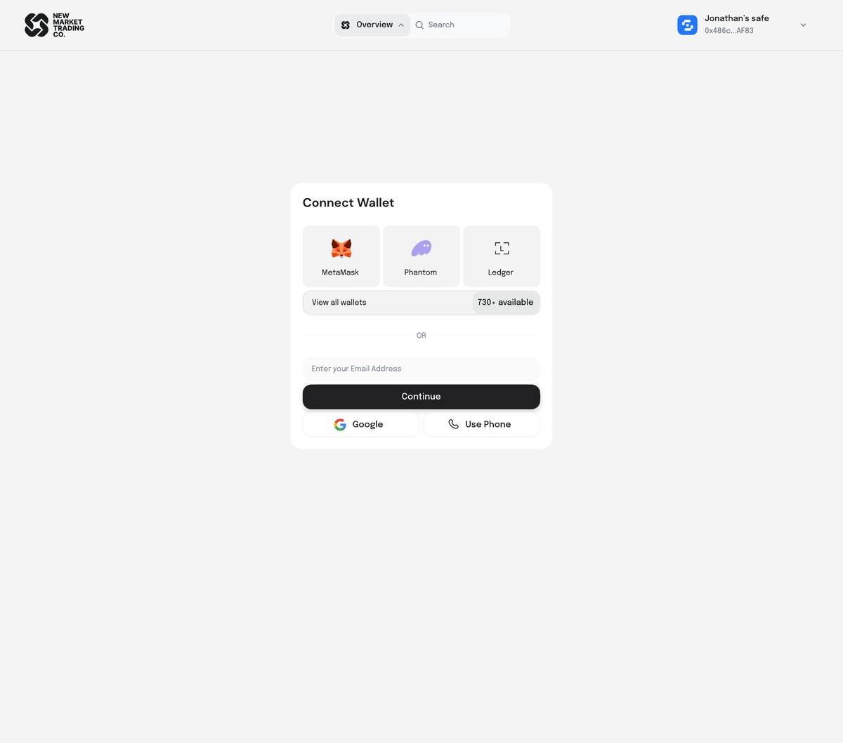
Connect Wallet — MetaMask, Phantom, Ledger, 730+ providers, or sign in with email, Google, or phone.
The two users this product serves
Jonathan — the Safe Owner
Manages his own Safe with real assets across Base, Ethereum, and Arbitrum. Actively provides liquidity on Uniswap V3 and deposits into Aave and Morpho. Currently uses 4–6 separate tools to do what NMT should do in one.
Biggest frustration: can't see his full picture in one place. Net worth is always an estimate. Doesn't trust UIs that only show USD — wants to see token amounts too, because that's what he'd verify against his wallet directly.
The Associate — the Advisor
Manages DeFi positions on behalf of multiple clients. When they find a good pool, they want to apply the same position to 10+ Safes at once — but each client gets a different dollar amount based on their portfolio size.
Biggest frustration: no platform was built for this use case at all. They were doing everything manually. NMT's associate flow — configure once, apply to many — was designed entirely from scratch for them.
03 — UX Design Process
The decisions that shaped the product.
Design happened in weekly sessions with the product lead. I'd present 3–5 options for each problem, we'd discuss the tradeoffs, and narrow down. Below are the real decisions — explained with the reasoning behind them, not just what we chose.
01 — The assets table: dropdown expansion over showing everything
Early versions of the assets/positions table tried to display every data point inline — value, APR, P&L, range, earnings. It was too much. CT flagged it: “It kind of loses its structure. There are just too many options displayed.”
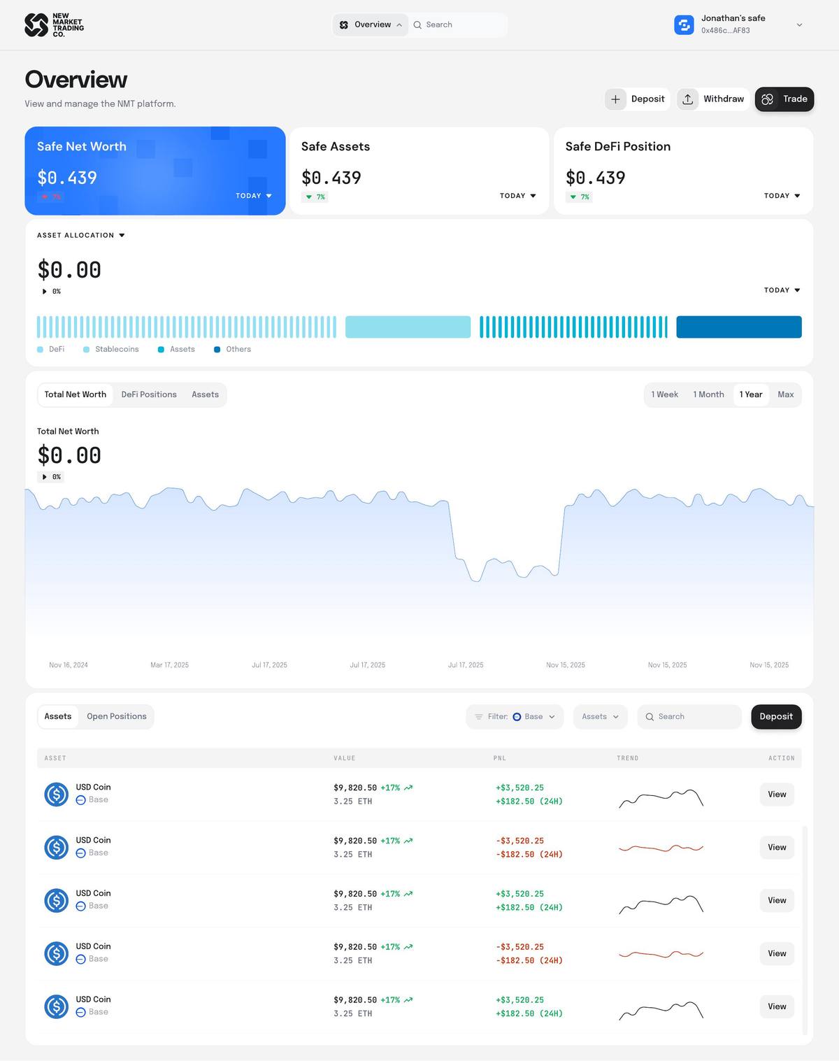
The decision: show a summary row (asset name, value, P&L, trend sparkline) and expand to show full details when clicked. The row expands in place — earnings breakdown, price range, min/max, current price, projected vs actual earnings, and action buttons (Add Liquidity, Withdraw, Close Position) — all without navigating away.
Why we kept the View button too
The expandable row and the View button do different things. Clicking the row expands the detail inline. View navigates to the pool's full detail page (with the APY chart, holdings, associated DeFi positions). We kept both because users coming from their open positions want to manage; users coming from Explore want to learn. The interaction model had to support both intents.
02 — The Explore page: grid cards + categories row + live result count
The Explore page had multiple problems at once: a left-hand sidebar filter that wasted space, no visible category chips (Meme Coins, Blue Chip Pools, Stable Coins, LST, Associate's Pick), and no feedback on how many results the active filters returned.
The solution pulled all of this into a stacked header structure: a scrolling stats strip (24H Volume, Total NMT TVL, Uniswap v3/v4 TVL, Aerodrome TVL), then a filters row (Chains, Wallets, Protocols, TVL range, APY range), then a categories row as horizontal chips. Below that: the grid with a live count — “Showing: 326 Results” — that updates as filters are applied.
Associate's Pick is just another category
CT made this call during review: Associate's Pick isn't a special toggle off to the side — it's a basket, the same as Meme Coins or Stable Coins. Treating it differently would confuse the mental model. It went into the categories row with a toggle switch, same as everything else.
03 — The navigation: dropdown over persistent sidebar
The original design had a left-hand sidebar with Overview, Activity, Consult, Calendar, Reports, Settings, Integrations, Bug Report. It worked on the Overview page but became a problem on the configure flow pages — the sidebar took up space, broke the page hierarchy, and felt wrong sitting next to a focused transaction screen.
We removed the sidebar and replaced it with a dropdown anchored to the top navigation. When you click the Overview button in the top bar, a dropdown opens showing all navigation options. It persists across all pages — but stays collapsed so it doesn't compete with the page content. The favorite option (my pick, CT agreed) looked like a natural part of the nav bar rather than a separate UI element.
Why not a hover interaction
I explored a hover-reveal version — mouse over an arrow and the nav slides out. CT shut it down cleanly: “Our clients are 50+. They know how to use a dropdown instinctively. A hover nav? They'll miss the arrow, and if they find it, they won't know how to make it come back.” Predictability beat cleverness.
04 — The configure position flow: Explore → Configure → Choose Safes → Summary → Execute
The hardest flow to sequence was the associate's transaction. Initially the “choose which Safes to apply this to” step was at the beginning of the flow. CT corrected this: “Move it closer to checkout. They should finish setting up the position first — ranges, ratios, everything — and only at that point are they thinking about who this is for.”
The final sequence: find the pool (Explore) → configure the position (set price range, deposit tokens) → choose which Safes and how much for each (Choose Safes) → review everything (Summary) → execute. The Summary page shows one position applied to multiple Safes, with a token and dollar amount input per Safe — because the same position might be $10,000 for one client and $500 for another.
After execution: redirect to Explore, not Overview
Where do you land after a successful transaction? My instinct was Explore — the transaction is done, they might want to find another opportunity. CT agreed: “The transaction is already done. Reset to Explore, it makes sense.” Overview would feel like a dead end after a focused transaction flow.
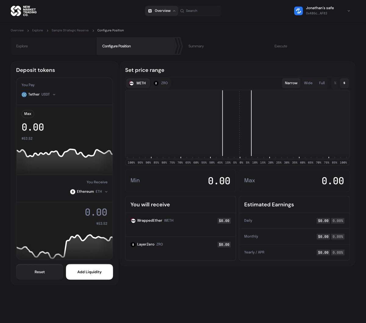
05 — The Zap page: single token entry, chart as the primary element
A Zap is different from a regular LP: instead of providing both tokens in a pair, the user picks any single asset they hold and the platform converts it into the correct ratio automatically. This meant the configure page couldn't just reuse the swap card layout — there was no “You Pay / You Receive” exchange. There was just: pick one asset from your Safe.
The challenge was what the page actually needed: a token selector (small — just pick one), a price range chart (large — this is the primary decision), min/max price inputs, percentage/price toggle, a narrow/wide/full range preset, and a token-price switcher so users could define the range in terms of either token. After many iterations, the solution was to make the token selector a compact component on the left and let the price range chart dominate the right — the opposite proportion from what we started with.
Why the chart had to be big
CT: “The chart is way down here. We want to be able to see the chart, we want to be able to adjust the range, and we don't need a swap card — we're only picking one asset.” In the current production version, the chart was buried. On the redesigned page, it's the thing you look at first.
06 — Transaction states: three named steps, not a spinner
The most anxious moment in DeFi is between clicking confirm and seeing a result. The original design had one modal with a generic loading state. We designed three distinct states: Submitting Transaction (sending to the network), Waiting for Confirmation (submitted, waiting for the user to confirm in MetaMask — the pop-up appears top-right), and Position Created Successfully (done, with options to Explore or Manage Position).
Why named states prevent real mistakes
When a financial transaction goes silent, users assume it failed. They click again. Named states tell them exactly what the blockchain is doing and what they need to do next (confirm in MetaMask). The “Waiting for Confirmation” state is specifically for the moment the user needs to act — it had to be clearly distinct from “Submitting.”
07 — The swap card: the “big stupid” option won
I explored many swap card layouts — the standard small box, two cards side by side, charts integrated into the card, micro-interactions on the swap arrow. CT kept coming back to one option: the large side-by-side layout with a chart integrated below each token. His words: “It's big and it's stupid. In the best way — it's really obvious what's going on.”
The big card won because it matched the boldness of the overview page (which also went big — full-width chart, large KPI numbers). The whole platform had to feel consistent in its visual confidence. Ryan (the third stakeholder) agreed too — two out of three meant it became the direction.
Buttons matter more than people think
CT flagged button design repeatedly: “The current buttons are too flat. I want them to come alive.” We iterated on the Deposit, Withdraw, and Trade buttons specifically — landed on outlined style for Deposit/Withdraw, white with a drop shadow for Trade. The swap card's execute button got its own treatment: it had to feel clickable, not passive. Color, weight, and shadow all signal “this is the action.”
08 — Open positions: all the data, none of the chaos
The current production open positions view was CT's biggest complaint: “We've crammed so much information into this one little box. APR is behind a tooltip. The range isn't visible until you hover. And then the actions — close position, withdraw fees, add liquidity — are all buried.”
The redesigned position row shows at a glance: protocol + chain + asset pair, position value + P&L, APR, and an “In Range / Out of Range” status badge. Clicking the row expands to show: price range visualiser (min / current / max), earnings breakdown (24H actual, 30D actual, 365D actual, 24H projected, 30D projected, 365D projected, fees), and three action buttons. Everything is visible without a single tooltip.
04 — Final Design
The product, screen by screen.
Every screen shown here is in its real flow context — not isolated components. The full product covers five flows: onboarding, portfolio overview, DeFi exploration, position configuration (LP, Swap, and Zap), and settings/permissions.

Connect Wallet — MetaMask · Phantom · Ledger · 730+ providers · email · Google · phone
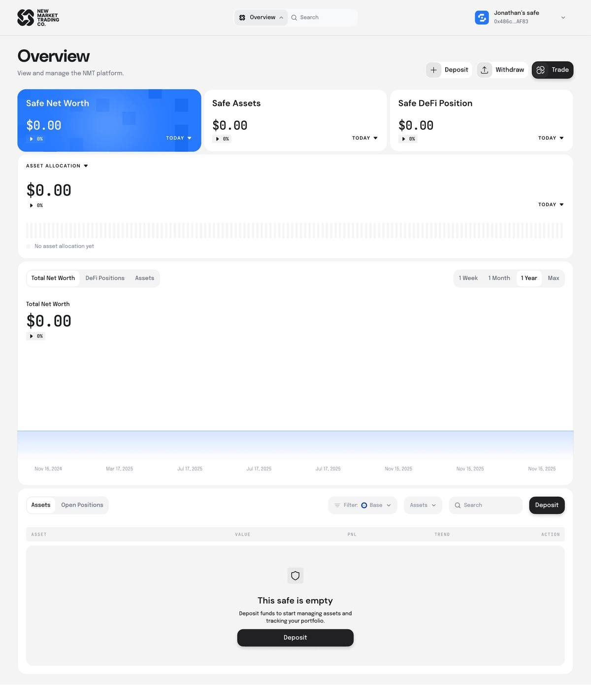
Overview — Empty state: Safe connected, no assets — single CTA to deposit, no dead ends

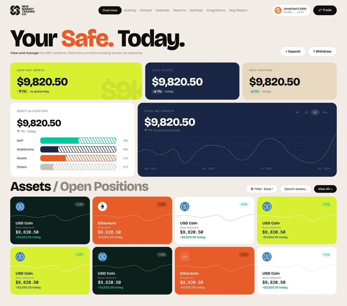
Overview — Assets loaded: KPI cards, allocation bar, net worth chart, full assets table
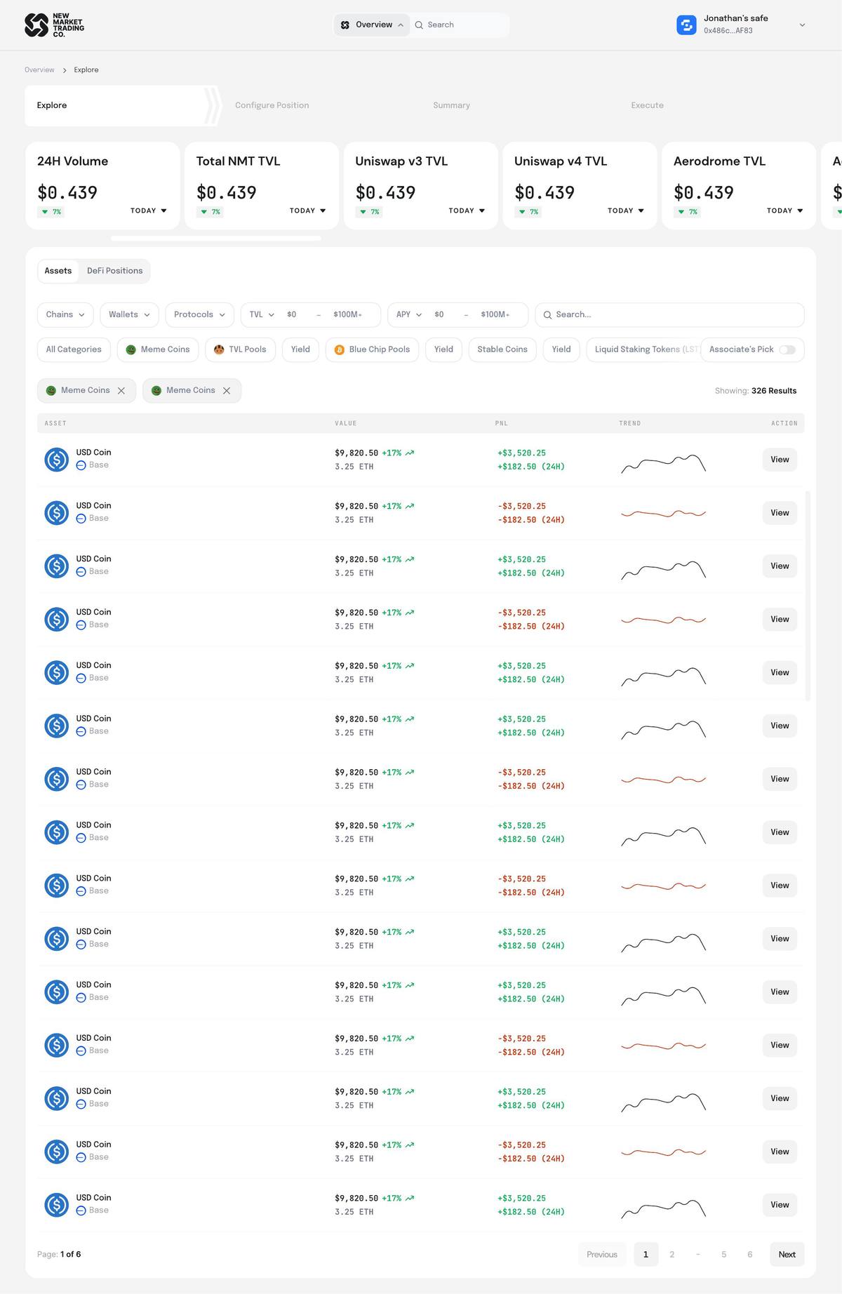
Explore — DeFi Positions view: Stats strip · category chips · filters · grid · “Showing: 326 Results”
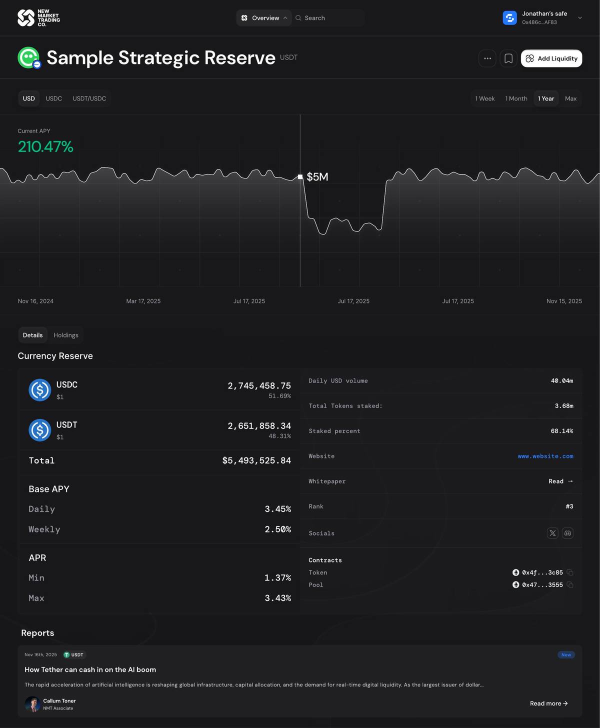
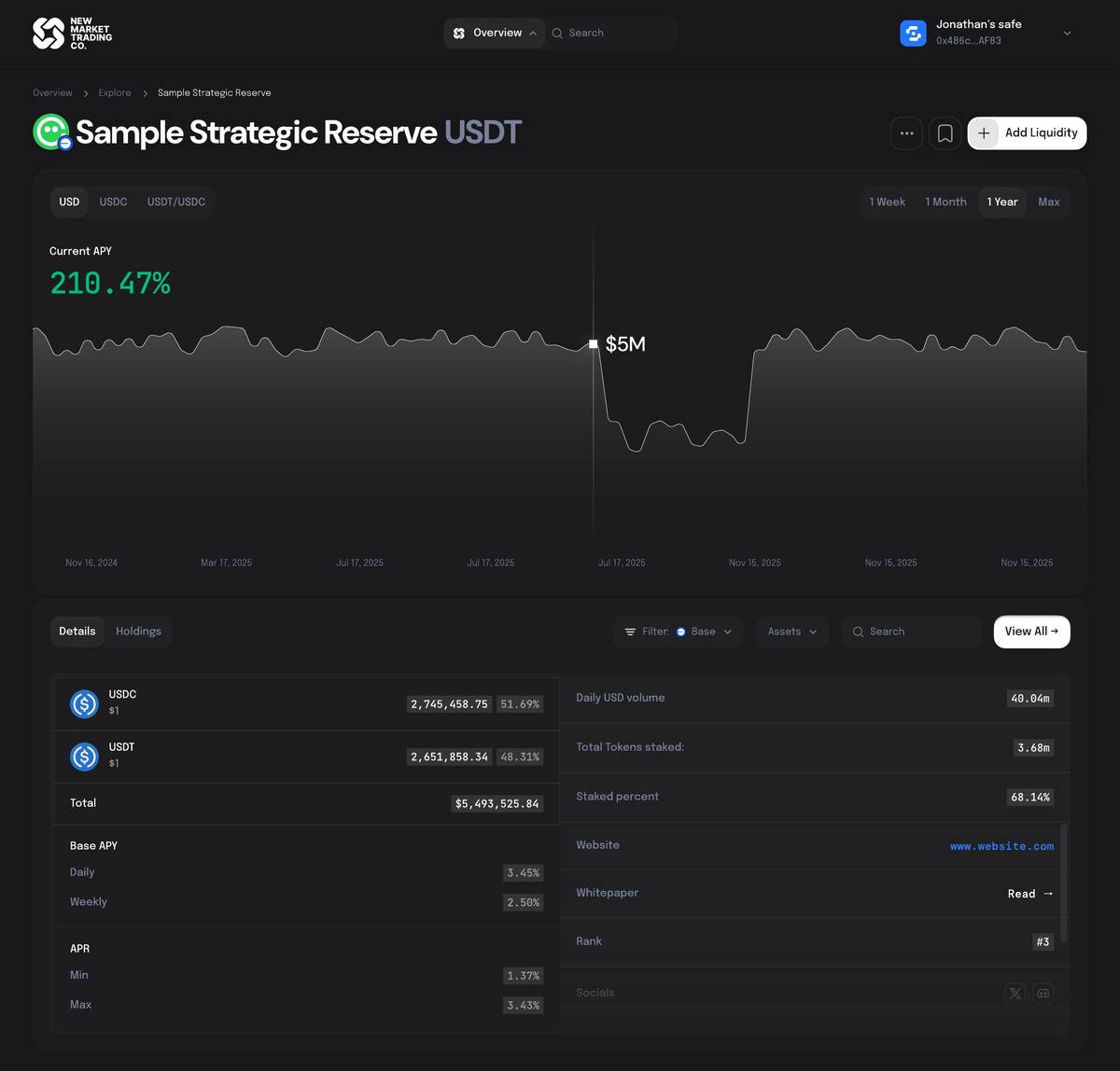
Pool / Asset detail page: APY chart · currency reserve · Base APY · APR · associated DeFi positions
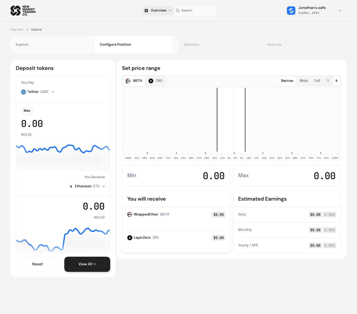
Configure Position — LP mode: Deposit tokens · WETH/ZRO price range · narrow/wide/full presets · estimated earnings
Configure Position — Swap mode: Single token entry · live exchange rate · network fee · no price range needed
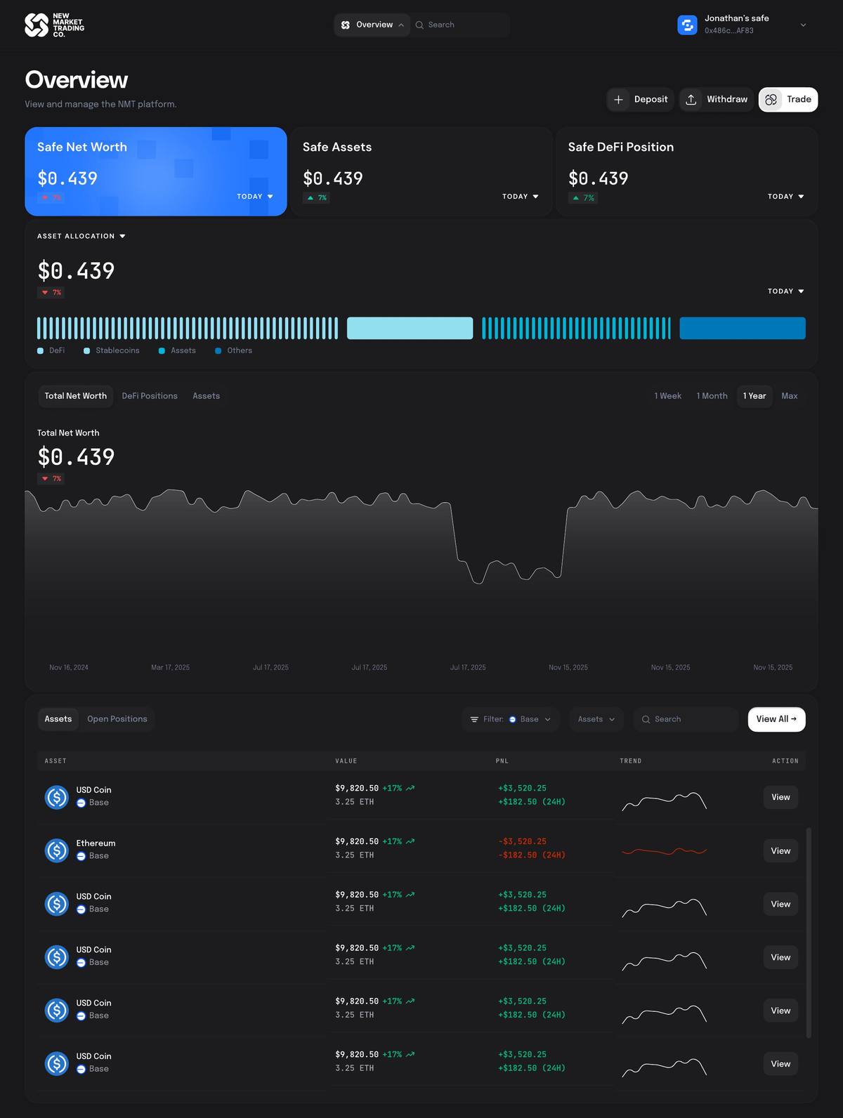
Dark Mode — Overview loaded: Full portfolio view · DeFi + Stablecoin + Assets + Others allocation
Dark Mode — Open position expanded: ETH/USDC · In Range · price range · earnings breakdown · Add Liquidity / Withdraw / Close
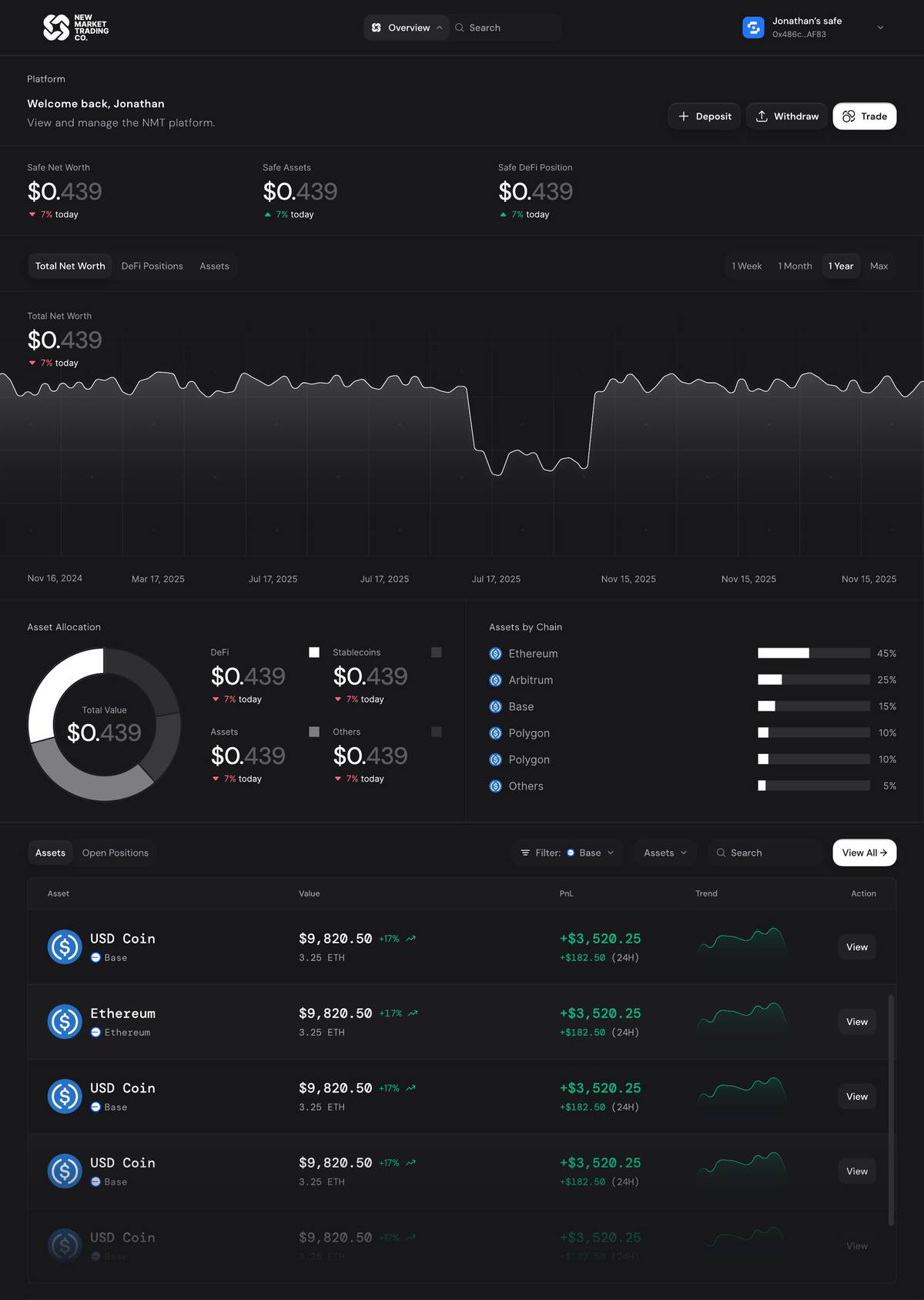
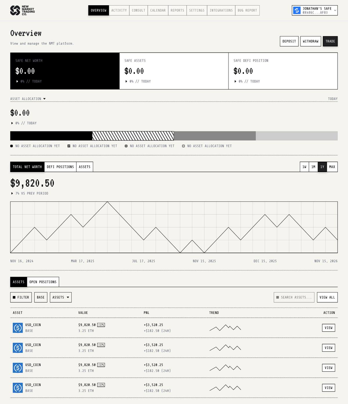
Early dark — Welcome back overview: Asset allocation donut · assets by chain · net worth chart · full position table
Six themes, one system.
Designing across six visual aesthetics wasn't stylistic indulgence — it was structural QA. Every time a layout broke in a different theme, it exposed a hierarchy problem that needed fixing, not a theme problem. The Light and Dark modes are the primary deliverables. The others proved the underlying architecture was sound.

Every path, mapped.
The full flow covers five journeys: onboarding via wallet or email, portfolio overview, DeFi exploration, position configuration (three sub-flows for LP, Swap, and Zap), and settings management including on-chain Safe module permissions and owner/associate roles.
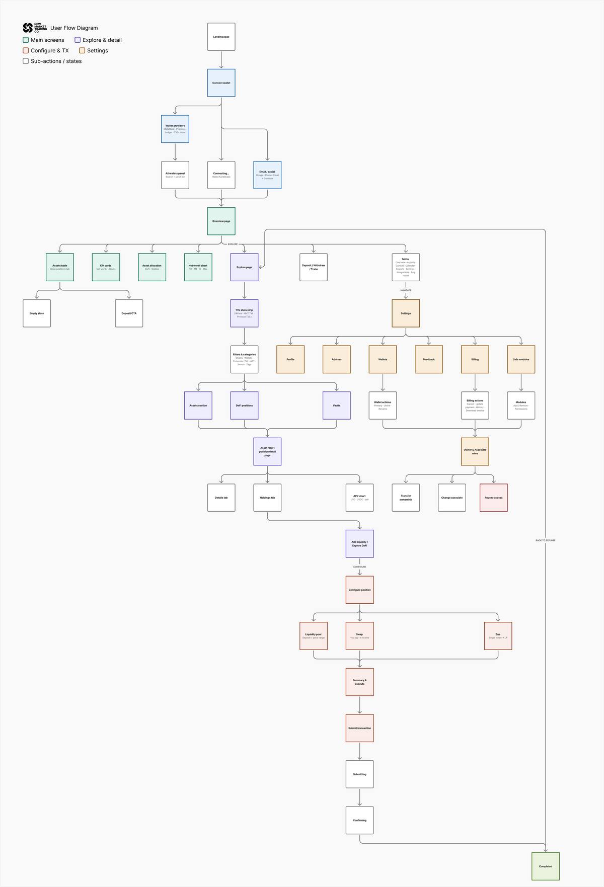
Full user flow — five journeys mapped end-to-end: onboarding, overview, explore, configure, and settings.
05 — Learnings
What this project taught me.
Working on NMT over months of weekly iteration changed how I think about design reviews. The most useful sessions weren't the ones where CT said “yes” — they were the ones where he said “I keep coming back to this one weird option and I don't know if I like it because it's weird or because it's actually good.” That kind of uncertainty is productive. It means we're in territory worth exploring.
The Zap page was the hardest problem I worked on. It looked simple — just pick a token and set a range. But the real question was: what's the primary element on this page? We went through probably fifteen iterations before landing on the answer: the chart is the primary element, the token selector is secondary, and they can't live at the same visual weight. Once that hierarchy was clear, the layout fell into place.
Designing six themes taught me to separate what a UI must communicate from how it looks while doing it. The terminal theme — monospace, dashed borders, no color — stripped away every visual shortcut and forced me to prove the information hierarchy worked on structure alone. The screens that survived that test unchanged were the ones that were actually right.
The associate flow taught me that designing for a power user's workflow is a completely different problem from designing for a single user's interface. Associates are managing positions for 10–30 clients at once. Every extra click costs them real time across every Safe they manage. That changes what “clean” means entirely.
What worked
- Expandable table rows over showing all data inline
- Category chips as a horizontal row — visible, scannable, filterable
- Three named transaction states (Submitting → Confirming → Done)
- Moving Safe selection to just before execute, not at the start
- Nav dropdown that doesn't compete with page content
- Chart as primary element on the Zap configure page
- Showing both USD value and token amount on every asset row
What I'd revisit
- Involve engineering earlier on the price range slider interaction
- Design the mobile version of the configure flow
- Build a proper notification system for out-of-range positions
- The admin page for associates still needs more iteration
Tools & context
- Figma — all design and prototyping
- Weekly video sessions with the product lead
- Safe Protocol — wallet infrastructure reference
- Uniswap V3 / Zap / Aave / Morpho — protocol knowledge